Pages

Monday, December 12, 2011

DMA101 - Character Illustration

For this project i chose to vectorize an illustration of a boss from the video game Borderlands. This little guys name is Nine Toes and was one of the first bosses I faced in the game as well as probably one of the funniest bosses Ive ever faced in any game. This is the original sketch by Kamikazuh. 


After I printed it out and figured out what lines I was going to use I started doing the the line work for the head. I imported the original into Adobe Illustrator CS5 and went to town.


Getting the lines right was tricky and tedious but eventualy I got it all worked out, i separated different body parts into different layers so that I could lock out the parts I was finished. This prevented me from accidentally clicking something and moving it or making a change i didn't intend to. This is the sketch after most of the lines were done.

After i had this done I created another layer that I used to put the shading lines in. The reason for this is it allowed me to to dim the whole layer and turn down the opacity so that a little of the color could come through. Then I created another layer that I put under the line shading so that the lines would show up on top. This layer was also dimmed and the opacity was turned way down. Below was the result.

Next I added some color on a layer that was moved under all the others so that all the lines would be over top of all the color.

This is the final product I came up with. I added a background to give it a little bit of a more authentic feel.


Saturday, December 10, 2011

DMA101 - 3D Scenes

For this assignment we had to create a 3d scene in Illustrator with at least 1 3d object per scene. I chose to do a space scene and a scene from Mario Bros. After a bit of time playing around with the 3d I finally got the hang of it. The image mapping gave me the most hassles but again once I got it down I finished very quickly.


Thursday, November 24, 2011

DMA179 - T-Rex Assignment

So for this project we were instructed to make a scale clay replica of a T-Rex tooth. For this I used a box of super sculpy that I bought at the school book store. Before i started construction of my tooth I had to do a little bit of research into what the dimensions are and what the tooth looked like. I came across a lot of different info that ranged from teeth that were 4 inches all the way to 10 inches. I chose to do mine at a solid 7.5 inches to make sure it was big enough that I could add some details and get a good shot for my poster.  For the interior construction of the tooth I used a whole bunch of tin foil, I just scrunched it up and molded it to the basic form I wanted. After i was happy with the basic form I took a bunch of clay and started to layer it over top the tin foil.With a little bit of playing around I had my tooth, I used my nails to make the serrated edge.  After cooking it in the oven for a bit I panted it using some paints that were laying around the house. This is the final product.


Next I started to do some research into what kind of font the ROM uses for the dinosaur exhibits. After spending too much time going no where and exhausting all of my resources I found a font that I thought worked fairly well for the poster. Below is the style guide I came up with for my poster. I used the text Pirulen that i found on a free font website for the heading and sub heading. I used Kalinga as the font for the body because it looked like some of the font i saw on the ROMs site and it is still easy to read. 


After completing this step, work on my poster kicked into full gear. After spending a fair bit of time playing around with a few different designs I came up with my final product which can be seen below. i decided to use gry for the the background because its a nice neutral color and i diffused a picture of a T-rex skeleton into the background to give it a bit of dimension and make it less boring. One problem I had was the black type for the paragraph on the grey background. Originally it was a bit hard to read with the orange of the tooth there as well so I decided to but a faded grey background behind it. this kinda separated it from the background and the tooth without being too distracting.


Sunday, November 20, 2011

DMA101 - Sports Logo Vectorization


This is what the logo first looked like after I had gotten the yellow, blue and white done. I had this part done prety quick with out much fuss.

Next I started adding in the details like the orange in the eye and the accents as well as the light blues. The orange parts were a little bit trickier than I thought they would be just because of the fact that there was a lot of curved parts to them. These took a bit of time to work out because they tended to loop over each other and produce odd looking shapes but eventually I got it figured out. I also used guides to make sure the flat parts of the light blue area would line up properly everywhere and provide good spacing for when i added the light greys.

This part ended up being the most frustrating part. Adding the light greys and light blue over the white in the teeth. I had to make sure to blend the lines in so that there was a smooth transition from white to colour and I also had to make sure the colour overlapped the white onto the dark blue a little bit as to make sure none of the white came through.


This is what the final vectorized Nashville Predators logo ended up looking like. I was quite pleased with the outcome considering this was my first real attempt at vector art.

Sunday, November 6, 2011

DMA204 - Product Shot

Below are 2 pictures that I took for a project in my photography class. We were instructed to do a product shot and these are the two best shots in my opinion. They were shot using the lighting in my room and a Monster t-shit I own, the shirt was used as a backdrop in one and the base in another. For the first shot I used an add in a BMX magazine as a backdrop. I wasn't sure if we could do that so  handed in the bottom one for grading.


Sunday, October 16, 2011

DMA101 - Audi R8 Home Page Design

For this project we were instructed to design the home page for the Audi R8. We did a bunch of work in class and came up with this design.
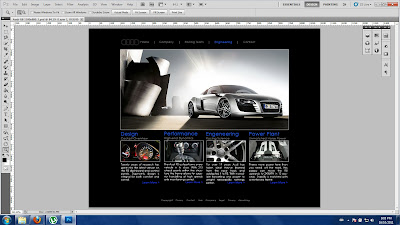
After going home and looking at other car manufactures websites i started planning and coming up with ideas. The following are screenshots of my project as i was working through it.


I spent quite a bit of time thinking about where to put certain things and what to add. Using other websites as reference definitely helped get the creative ideas flowing. After adding a couple main images to choose from and multiple background colors i ended up with this as my final design. 
All in all this project was super fun and challenging at some points but it was a great learning experience.

Sunday, October 9, 2011

DMA179 - Morlock Assignment


2 Photos of warning signs on the subway.


 Group shot at the subway.

St Andrews Subway Station.

We couldn't find the art at King and Emily so i just took some pics of the street signs.

 
A picture of some of us in a bus shelter.

Picture of the java house and the special that day. Sounded like a wicked deal to me.


Portland and Queen.

New York Subway.


Photo of Gandhi Store front.

The Silver Snail and the flyer they had inside.


The robots on the wall of Active Surplus and Adam buying a Cable of some sort.


The patio at the Black Bull was under construction but i got a shot of the sign.

Outside Black Market


One of the best spots in Toronto where the strangers are always super friendly.


As a kid i allways wondered how this got there...

After all was said and done we hit the beer store and enjoyed the rest of the day.

Saying goodbye, i may have enjoyed a bit to much.

Shots of some graffiti we saw downtown.